Blog
7 Must-Know Marble Pattern Tips: Choose the Right One & Avoid Costly Mistakes
When it comes to elevating the look and feel of a space, marble remains one of the most timeless and luxurious materials available. Its natural beauty, rich textures, and elegant veining patterns have made it a favorite among architects, interior designers, and homeowners for centuries. Whether it’s used in flooring, countertops, backsplashes, or statement walls, marble brings an undeniable sense of refinement and sophistication to any environment. However, selecting the best marble pattern is far from a straightforward decision. It involves more than simply choosing a color or a slab that looks appealing in a showroom.
Marble patterns vary widely—from bold, dramatic veins that command attention to soft, subtle flows that offer quiet elegance—and each pattern interacts differently with space, lighting, and other design elements. The wrong pattern can easily disrupt your design vision, clashing with your color palette or creating visual chaos. Even worse, it can overwhelm the room entirely, drawing attention away from the overall aesthetic. On the other hand, the right marble pattern can do just the opposite: it can enhance your layout, complement your furnishings, and elevate the atmosphere of the entire room. In the end, choosing the ideal pattern is about striking a perfect balance between beauty, functionality, and personal style.
Below are 7 essential tips to help you select the perfect marble pattern—and avoid the pitfalls that could ruin your renovation.
Table of Contents
1. Understand the Space You’re Working With
Not every marble pattern suits every room, and understanding the relationship between the pattern and the space is key to achieving a cohesive design. One of the most common mistakes homeowners and even designers make is selecting a pattern based solely on appearance, without considering how it will interact with the room’s proportions and layout.
For instance, large, dramatic veining with high contrast can be absolutely stunning in expansive areas like entrance halls, open-plan kitchens, or luxury living rooms. In these larger spaces, bold patterns have room to breathe and become focal points that add grandeur and visual interest. The scale of the space allows the veining to be appreciated from different angles and distances without feeling too intense.
In contrast, applying that same bold pattern in a compact area like a guest bathroom, powder room, or narrow hallway can be overwhelming. The strong lines and contrasts can make the room feel smaller, busier, or even chaotic. Instead of feeling luxurious, it may end up looking cluttered or mismatched.
Lighting also plays a significant role in how marble patterns are perceived. Natural light enhances the depth and complexity of veining, while artificial light may cast shadows or highlights that change the pattern’s impact. Rooms with ample sunlight can handle more contrast and movement, while darker rooms may benefit from lighter, more uniform patterns that reflect and maximize available light.
Finally, think about the mood you want to create. Soft, delicate veining promotes a calm and serene atmosphere—ideal for bathrooms, spa-like retreats, or minimalist spaces. Meanwhile, bolder and more expressive patterns add drama and personality, making them well-suited for feature walls, fireplace surrounds, or artistic installations.
Pro Tip: For smaller or dimly lit areas, choose marble with gentle, understated veining in lighter tones to open up the space and maintain a clean look. In larger, well-lit rooms, you have more freedom to experiment with eye-catching patterns that make a statement without overpowering the design.
2. Match the Pattern to Your Design Style
Your choice of marble pattern should do more than just look beautiful—it should seamlessly align with the overall design style of your space. Marble is incredibly versatile, but not every pattern or color works well in every design context. Whether your vision leans toward modern minimalism, classic elegance, rustic charm, or bold luxury, the right marble pattern can enhance and unify your aesthetic.
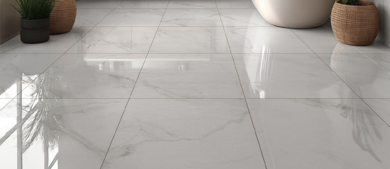
For a modern or minimalist interior, less is more. Clean lines, neutral color palettes, and uncluttered surfaces are key principles of this style, so your marble should reflect that simplicity. Classic white marbles like Carrara, known for their soft gray veining and consistent appearance, are ideal. Their subtle patterns add visual interest without distracting from the minimalist ethos. They also pair beautifully with modern materials like glass, stainless steel, and matte black fixtures.
On the other hand, if you’re going for old-world luxury, Antique Onyx or other exotic varieties might be your best bet. Autumn Blend features bold, wide veining with dramatic movement and often includes warmer tones such as gold or beige, making it perfect for traditional, Mediterranean, or baroque-inspired spaces. These patterns lend an air of opulence and grandeur, particularly when used in formal settings like dining rooms, grand foyers, or feature walls.
Rustic and earthy interiors—such as farmhouse, Tuscan, or industrial styles—can benefit from marble patterns that incorporate warmer hues and more organic movement. Look for marbles with brown, taupe, or golden undertones, as these will complement natural materials like wood, leather, and stone.
The key is harmony. A mismatched marble pattern can feel jarring and out of place, undermining the flow of your design. But when chosen thoughtfully, the right pattern can reinforce your style, highlight your space’s best features, and tie the entire room together.
Pro Tip: Before making a final decision, collect samples or digital mockups of your marble options alongside your cabinet finishes, flooring, and paint colors to see how everything interacts. It’s the best way to ensure your marble pattern doesn’t just look good—but looks right.
3. Pay Attention to Color Variations
When choosing the best marble pattern, it’s easy to focus on the veining and overlook something just as important: color variation. Marble is a natural stone, and even slabs from the same quarry can display noticeable differences in hue, tone, and undertone. This means that two pieces of what’s labeled as the same marble—say, Carrara —can look surprisingly different when placed side by side.
Some marble patterns may lean cooler with bluish-gray veining, while others of the same name might appear creamier or have subtle warm undertones like beige, taupe, or even hints of gold. These variations can have a significant impact on the final look of your space, especially when combined with specific cabinet colors, wall paints, or flooring choices.
If you’re aiming for a crisp, modern aesthetic with cool-toned grays and whites, a slab with warmer or yellowish tones can throw off your entire palette. Likewise, if your space is designed with earthy or rustic finishes in mind, choosing a marble that’s too stark or cold can feel visually disconnected.
Avoid This Mistake: Don’t assume that all “white marble” is created equal. The name alone isn’t enough to guarantee consistency in color or veining. Always ask to see the actual slab in person if possible, especially for larger projects like countertops or flooring. If in-person viewing isn’t feasible, request high-resolution photographs or physical samples that represent the full range of variation.
Also, keep in mind that lighting—both natural and artificial—will affect how these colors appear. A marble that looks cool and neutral under showroom lights might reveal warmer tones in your home environment.
Pro Tip: When selecting multiple slabs for a larger installation, choose pieces from the same block or lot to maintain color consistency throughout your project. This extra step can make a huge difference in achieving a cohesive and harmonious final result.
4. Think About Maintenance
While the visual appeal of a marble pattern often takes center stage, it’s just as important to think about how your choice will perform over time—especially in high-traffic or high-use areas. One of the most overlooked factors when selecting the best marble pattern is how well it can stand up to daily wear and tear, spills, and cleaning.
Heavily patterned marble with dramatic veining and rich color variation can actually be a smart and practical choice for surfaces like kitchen countertops, bathroom vanities, and flooring. The busy, irregular nature of the veining helps to disguise minor stains, etching, scratches, and general signs of use, allowing the surface to maintain a polished look for longer. This doesn’t mean the stone is impervious to damage—but it can make small imperfections far less noticeable.
In contrast, light-colored marbles with subtle, clean veining—while incredibly elegant—can demand a higher level of maintenance. These types tend to reveal every mark, water spot, oil stain, or acid etch much more clearly, especially on white or pale backgrounds. For example, a pristine slab of Thassos or Statuario marble will look stunning when freshly cleaned, but it may require frequent wiping, sealing, and extra care to preserve that flawless finish over time.
Additionally, certain finishes like honed marble, which has a matte look, tend to show etching less than polished finishes, even though they might absorb stains more readily. The finish you choose should also align with the pattern and your lifestyle.
Pro Tip: If you’re designing a busy kitchen or a family bathroom, consider marbles with more variation and movement. They’ll give you the luxury look you want without the constant stress of upkeep. And no matter which pattern you choose, always seal your marble and use proper cleaners formulated for natural stone to extend its life and beauty.
5. Inspect the Slab Before Buying
One of the most important aspects of choosing the right marble pattern is understanding that no two slabs are identical. Marble is a natural stone, and each piece carries its own unique variations in color, veining, and texture. While photos and digital samples can give you a general idea of what to expect, they often fail to capture the true complexity of the stone. Lighting conditions, camera angles, and screen settings can all distort how the marble appears.
For example, a marble slab with subtle, delicate veining in a photo might appear bolder or more pronounced in person, depending on the lighting in the showroom or the room where it’s installed. Similarly, what looks like a consistent pattern in a photo might reveal noticeable imperfections or irregularities upon closer inspection. These slight differences can dramatically affect how the marble fits into your overall design scheme.
The best way to ensure you’re getting the exact look you want is to view the slab in person at a showroom or stone supplier’s warehouse. By doing so, you can examine the flow of the veining, the color palette, and any natural fissures or patterns that may not have been visible in photos. This allows you to assess how the marble will truly look in the space—especially important for larger installations like countertops or floors where pattern flow is essential.
Seeing the slab in person also helps you determine how the pattern will align with other design elements, like cabinetry or flooring, and how the light will interact with the stone’s surface. If possible, you should also ask to see the actual pieces that will be used for your project, as slabs can differ even within the same lot or shipment.
Pro Tip: When purchasing multiple slabs for a larger installation, make sure to inspect each one carefully. If you’re buying online, request clear, high-resolution images of the specific slab you’ll receive, and don’t hesitate to ask for more details about its veins and patterns. Additionally, request a sample if available to help with color matching and final decision-making.
6. Consider Bookmatching for a Bold Statement
If you’re looking to make a dramatic, artistic statement with your marble, bookmatching might be the perfect choice. This technique involves placing two marble slabs side by side in a mirrored fashion, creating a stunning symmetrical effect. The result is a pattern that resembles the pages of an open book, with the veining flowing seamlessly from one slab to the next. The mirrored veins create a mesmerizing visual symmetry, making it one of the most eye-catching ways to use marble in design.
Bookmatching works particularly well in large spaces such as feature walls, grand fireplace surrounds, or even as a focal point in a luxury bathroom. The bold, symmetrical patterns add an element of high drama and sophistication, transforming a simple marble feature into a true work of art. When executed properly, bookmatching can elevate a space to a level of elegance that few other design techniques can achieve.
However, there are a few important considerations before opting for this style. Bookmatching works best with large-scale veining, such as that found in marbles like Carrara, or more exotic varieties with dramatic, sweeping lines. Smaller, finer veins or less pronounced patterns may not show up as effectively when mirrored, and the result might feel disjointed rather than cohesive.
Additionally, precision is key when it comes to bookmatching. This technique requires highly skilled installers who can perfectly align the slabs so that the veining flows symmetrically. Even a small misalignment can disrupt the pattern, making the overall effect less impactful. Given the complexity of the technique, it’s essential to work with experienced professionals who understand how to handle the material and create the desired look.
Caution: While bookmatching can be incredibly striking, it’s not the right choice for every space. The bold, symmetrical patterns can overwhelm smaller rooms or spaces with other intricate design elements. It’s best suited for large, open spaces where the pattern can truly shine.
Pro Tip: Before committing to bookmatching, ask for a digital mockup or use design software to visualize how the pattern will look in your space. This allows you to assess the overall effect and determine if the mirrored symmetry complements the rest of your design elements.
7. Balance Boldness with Practicality
While dramatic marble patterns can be absolutely breathtaking and serve as a striking focal point in a room, it’s essential to approach their use with caution. A bold, highly patterned marble with thick veining or vibrant color contrasts can draw immediate attention and make a statement, but it can also overpower other elements in the room. If the marble is too dominant, it could clash with your furniture, artwork, or other design details, making the space feel unbalanced. Additionally, what might seem like a timeless choice today may quickly feel dated in a few years, especially if trends shift or your personal tastes evolve.
Before choosing an extremely bold marble, take into consideration where it will be placed in the room and how visible it will be in the overall design. For example, if you’re using a high-contrast, dramatic marble for countertops in an open-concept kitchen or living area, it may compete with other features like backsplashes, cabinets, and flooring. On the other hand, using a strong marble pattern as a feature wall or a statement fireplace surround can give your space a luxurious, designer feel without overwhelming the room.
It’s also important to think about the longevity of the pattern. What feels trendy and bold now could look dated if the patterns are too specific to current tastes. A highly decorative marble might eventually lose its appeal as design preferences shift toward more subtle, timeless options. Choosing a pattern that remains versatile and blends well with evolving design trends is key to ensuring your space continues to feel fresh and relevant for years to come.
Remember: The best marble pattern isn’t necessarily the one with the boldest veins or the most striking colors; it’s the one that complements your space and enhances its overall aesthetic. The ideal choice reflects your personal taste, supports the design of your room, and stands the test of time—both in style and durability.
Pro Tip: If you’re unsure whether a bold marble pattern will work, try experimenting with smaller samples in your space. Place them near your other design elements to see how they interact. You may find that a more subtle marble is the perfect fit, or that a dramatic pattern works better in a smaller, more contained area.
Final Thoughts
Choosing the right marble pattern is far from a superficial decision—it’s a crucial element that can elevate the visual appeal, functionality, and overall atmosphere of your space. While the aesthetics of marble are undeniably stunning, understanding how different patterns interact with the space, lighting, and other design elements is key to creating a balanced, timeless interior.
By considering factors such as the size and scale of your room, your design style, the maintenance requirements, and the long-term impact of your choice, you can confidently navigate the wide array of marble options available. Whether you’re drawn to the subtle elegance of light-veined marble or the bold drama of bookmatched slabs, the best choice is one that complements your personal taste, enhances your space’s function, and stands the test of time.
Remember, when it comes to marble, a little foresight goes a long way. Taking the time to carefully select the perfect marble pattern—while keeping practicality, symmetry, and longevity in mind—ensures that your investment not only looks stunning but serves your design vision for years to come. So, take the leap, trust your instincts, and enjoy the lasting beauty that the right marble pattern can bring to your home.
Drop by our showroom to see our stunning collection:
Tampa, FL , St Petersburg, FL , Orlando, FL , Naples, FL , Sarasota, FL, Fort Myers, FL , Jacksonville, FL , Houston, TX and Savannah, GA